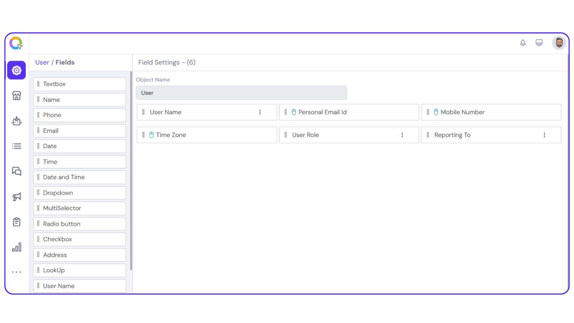
User Fields
User fields define the attributes required to create and manage a user account within the system. These fields form the structure of a user and allow you to capture essential information during the user creation process.
While you start creating the user object, the following fields will be open in the workspace by default:
‘User Name’, ‘Mobile Number’, ‘Time Zone’, and ‘Personal Email ID’.
You won’t be able to remove these fields. This is because these fields are mandatory when creating user accounts. In addition to these default fields, you can dynamically add other fields as needed to capture additional user information.
|
Note: The following actions can be performed in all the fields:
|
User Name
The User Name field captures the user’s name and is the first field displayed by default when creating a user object. This field is mandatory, as it serves as a primary identifier for account creation.
You can configure the following settings for the User Name field:
Set Validation Rules:
Define acceptable input criteria by choosing whether to allow:
- Special characters
- Numbers
- Lowercase and/or uppercase letters
Set Character Limits:
Define the minimum and maximum number of characters that can be entered as the user name.
Authentication via OTP:
You have the option to enable OTP-based verification of the user name through SMS or email. Currently, this feature is available upon request and must be activated by our support team through backend configuration.
Phone Number
The Mobile Number field is used to capture the user’s phone number during account creation. This field supports various configuration options to ensure flexibility and validation accuracy.
You can customize the following settings:
Display Fields:
- Country Code (mandatory)
- Mobile Number (mandatory)
- ISO Code (mandatory)
- Number Type (e.g., mobile, landline)
Separator Format:
Choose the desired separator for number formatting.
Phone Number Verification:
Enable OTP-based verification to validate the mobile number.
Country Names Display:
Select the country names that should be available for user selection.
Default Country Code:
Set a default country code for easier input.
Custom Regex:
Apply a custom regular expression for advanced validation rules.
Sample Validation Tool:
Test sample numbers to check if they meet the defined criteria.
Organization Name
The Organization Name field is used to capture the user’s organization details, which may be required to validate login credentials or segment users by company or department.
You can configure the following settings for this field:
Set a Default Value:
Predefine a default organization name, if applicable.
Validation Type:
Choose how input should be validated:
- Full Text: Allows alphabets, numbers, and special characters
- String: Allows alphabets and numbers, excluding special characters
- Alphanumeric: Allows only alphabets and numbers
- Custom: Define your own validation criteria
Regex:
Apply a custom regular expression for advanced validation.
Test Sample Validation:
Test input samples to ensure they meet the defined validation rules.
Character Limit:
Set a maximum and minimum number of characters.
Time Zone
The Time Zone field is used to capture the user’s time zone, which helps ensure accurate scheduling, reporting, and time-based automation.
You can configure the following settings:
Set a Default Value:
Define a default time zone for user accounts.
Validation Type:
Specify how input should be validated:
- Full Text: Allows alphabets, numbers, and special characters
- String: Allows alphabets and numbers, excluding special characters
- Alphanumeric: Allows only letters and numbers
- Custom: Define your own validation criteria
Character Limit:
Set a maximum and minimum number of characters.
Personal Email ID
The Personal Email ID field captures the user’s personal email address, which can be used for communication, recovery, or identity verification purposes.
You can configure the following settings:
Display Fields:
- Email ID: The main input field for the email address
- Type: Specify if the field accepts personal or official email types
Separator:
Define the character used to separate sections (if needed).
Validation Options:
- Domain Validation: Restrict or allow specific email domains
- Email Validation: Ensure the input follows a valid email structure
Character Limit:
Set a maximum character limit for the field.
Name
The Name field allows you to capture specific parts of a user’s name, such as first name, middle name, last name, prefix, or suffix, based on your data requirements.
You can customize the following settings for this field:
Field Type:
Define the name component you want to capture (e.g., Prefix, First Name, Middle Name, Last Name, Suffix).
Validation Type:
Specify how input should be validated:
- Full Text: Allows alphabets, numbers, and special characters
- String: Allows alphabets and numbers, excluding special characters
- Alphanumeric: Allows only alphabets and numbers
- Custom: Define your own validation criteria
Separator:
Set a character to separate different name components, if needed.
Character Limit:
Set a maximum and minimum number of characters.
Text Box
The Text Box field can be renamed and repurposed to capture any additional user information that doesn’t fall under predefined fields. It offers flexible customization to suit your data collection needs.
You can configure the following settings:
Validation Type:
Define how the input should be validated:
- Full Text: Allows alphabets, numbers, and special characters
- String: Allows alphabets and numbers, excluding special characters
- Alphanumeric: Allows only letters and numbers
- Custom: Define your own validation criteria
Character Limits:
- Set a minimum number of characters
- Set a maximum number of characters
The Email field is used to capture an email address from the user based on your specific requirements. It supports validation and formatting options to ensure accurate data entry.
You can configure the following settings:
Email Type Display:
Choose whether to display the type of email (e.g., personal, work).
Domain Validation:
Restrict or allow specific domains.
Email Verification:
Enable verification to confirm the email address is valid and reachable.
Character Limit:
Set the maximum number of characters allowed in the field.
Phone
The Phone field is used to capture any necessary phone number. This field supports various configuration options.
You can configure the following settings:
Display Fields:
- Country Code (mandatory)
- Mobile Number (mandatory)
- ISO Code (mandatory)
- Number Type (e.g., mobile, landline)
Separator Format:
Choose the desired separator for number formatting.
Phone Number Verification:
Enable OTP-based verification to validate the mobile number.
Country Names Display:
Select the country names that should be available for user selection.
Default Country Code:
Set a default country code for easier input.
Custom Regex:
Apply a custom regular expression for advanced validation rules.
Sample Validation Tool:
Test sample numbers to check if they meet the defined criteria.
Dropdown
You can add a dropdown menu in the user panel using this field. Only one option from the dropdown can be selected at a time. The dropdown menus can be entered in the ‘Field Values’ cell, separated by the Enter key.
Multi Selector
The Multi Selector field enables users to select multiple options from a dropdown menu. This is useful when more than one value may apply to a user or record. To configure the dropdown options, enter each value in the Field Values section, separated by the Enter key.
Radio Button
The Radio Button field is used when the user needs to select only one option from a predefined set. It simplifies decision-making by presenting mutually exclusive choices, commonly used for binary inputs such as Yes/No or True/False.
To configure the options, enter each value in the Field Values section, pressing Enter after each entry to add it as a separate choice.
Checkbox
The Checkbox field allows users to select multiple options simultaneously from a predefined list. This is ideal for cases where more than one choice may apply.
To set up the options, input each item in the Field Values section, and press Enter after each one to add it to the list.
Reporting To
Record who the user has to report to using this field.
Address
The Address field is used to capture detailed location information about the user. It offers flexible input options to suit different data collection needs.
You can configure the field to allow address entry in one of the following formats:
Manual Format:
Enables users to type in the full address manually.
Geolocation Format:
Allows users to select their location using geo-pointing or geo-search functionality.
Standard Format:
Displays structured address fields such as:
- Address (mandatory)
- Country
- State
- City
- Postal Code
Any or all of these fields can be marked as required (*) based on your data requirements.
Date
The Date field is used to capture specific date-related information such as Date of Birth, Date of Joining, or other relevant milestones.
You can configure the following settings:
Display Format:
Choose to display a single date, a date range, or a set of selectable days.
Date Format:
Customize how the date appears (e.g., DD/MM/YYYY, MM/DD/YYYY, etc.).
Selectable Dates:
- Specify whether users can choose past dates, future dates, or both.
- Define a custom date range to limit the selection window in the calendar view.
Time
The Time field is used to capture specific time values, such as meeting times, work shifts, or availability windows.
You can configure the following settings:
Time Format:
Choose between a 12-hour (AM/PM) or 24-hour format based on your preference.
Display Type:
Select whether to display a single time or a time range for the user to choose from.
Selectable Days:
Define the range of days within which users can select a time. (Note: This setting is typically used when time selection is tied to specific dates or scheduling windows.)
Date and Time
The Date and Time field allows you to capture both date and time together in a single entry, ideal for scheduling events, setting deadlines, or logging activities.
All configuration options available in the individual Date and Time fields can be customized here, including:
Display Format:
Choose to show a single timestamp or a range
Date Format:
Customize formats such as DD/MM/YYYY or MM/DD/YYYY
Time Format:
Select between 12-hour or 24-hour formats
Selectable Range:
Define valid date and time ranges, including past and future limits