Custom Fields
Custom Fields are user-defined fields used within Dynamic Objects to capture specific data based on unique business needs. These fields can be easily added to an object using a drag-and-drop interface, offering a flexible and intuitive setup process. 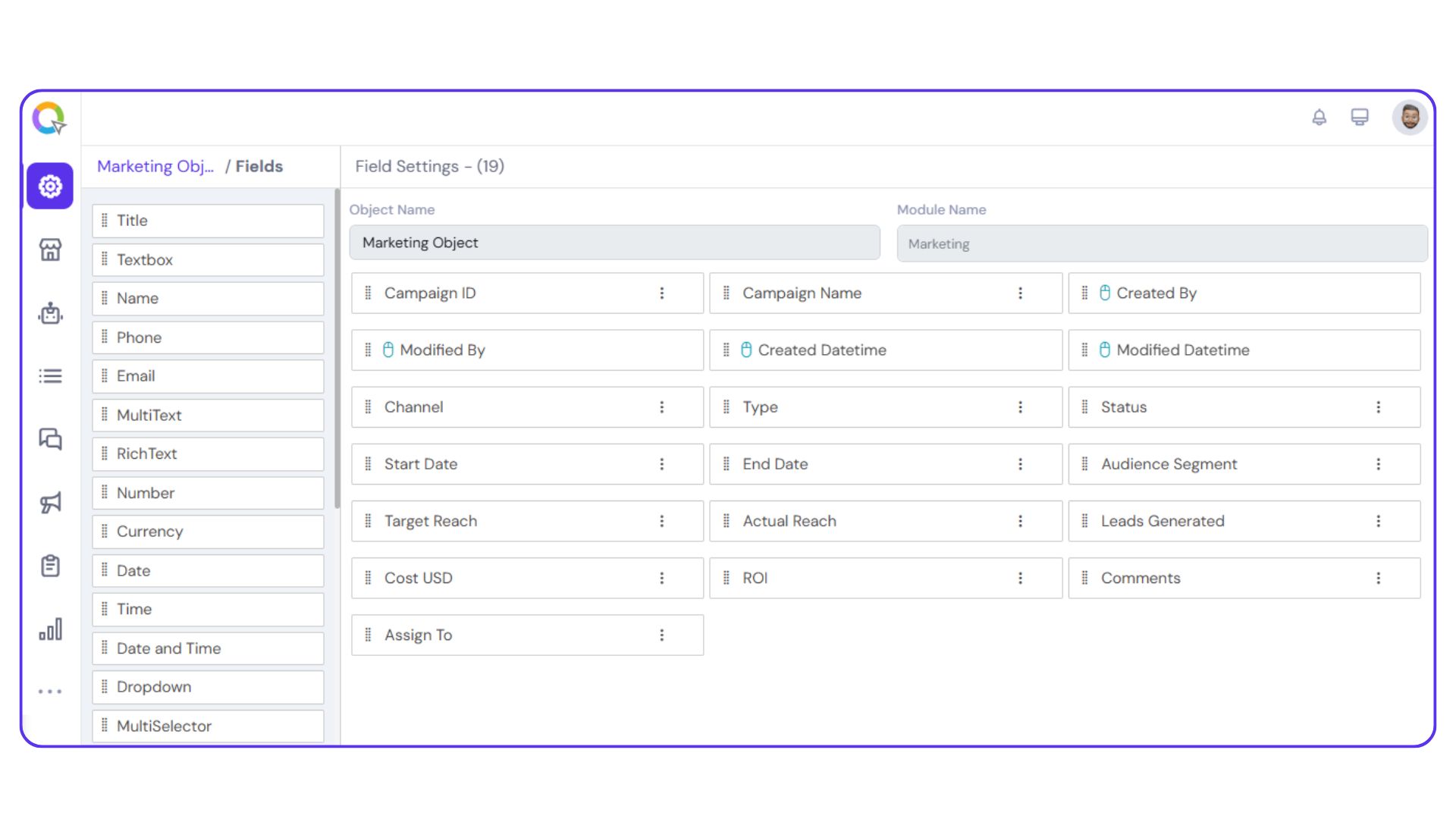
|
Note: The following actions can be performed in all the fields:
|
Title
The Title field is used to capture a person’s formal designation that typically appears before their name, indicating social status, professional role, or a mark of respect (e.g., Mr., Mrs., Dr., Prof., etc.).
You can configure the following settings:
Default Title:
Set a predefined title to appear by default, if needed.
Validation Type:
Specify how the input should be validated.
- Full Text: Allows alphabets, numbers, and special characters
- String: Allows alphabets and numbers only, excluding special characters
- Alphanumeric: Allows only alphabets and numbers
- Custom: Define your own validation rules
Character Limits:
Set a maximum character count to control input length.
Textbox
The Text Box field can be renamed and repurposed to capture any additional user information that doesn’t fall under predefined fields. It offers flexible customization to suit your data collection needs.
You can configure the following settings:
Validation Type:
Define how the input should be validated:
- Full Text: Allows alphabets, numbers, and special characters
- String: Allows alphabets and numbers only, excluding special characters
- Alphanumeric: Allows only alphabets and numbers
- Custom: Set your own validation rules using custom criteria
Character Limits:
- Set a minimum number of characters
- Set a maximum number of characters
Name
The Name field allows you to capture specific parts of a user’s name, such as first name, middle name, last name, prefix, or suffix, based on your data requirements.
You can customize the following settings for this field:
Field Type:
Define the name component you want to capture (e.g., Prefix, First Name, Middle Name, Last Name, Suffix).
Validation Type:
Specify how the input should be validated:
- Full Text: Allows alphabets, numbers, and special characters
- String: Allows alphabets and numbers only, excluding special characters
- Alphanumeric: Allows only alphabets and numbers
- Custom: Set your own validation rules using custom criteria
Separator:
Set a character to separate different name components, if needed.
Character Limits:
- Set a minimum number of characters
- Set a maximum number of characters
Phone
The Phone field is used to capture any necessary phone number. This field supports various configuration options.
You can customize the following settings:
Display Fields:
- Country Code (mandatory)
- Mobile Number (mandatory)
- ISO Code (mandatory)
- Number Type (e.g., mobile, landline)
Separator Format:
Choose the desired separator for number formatting.
Phone Number Verification:
Enable OTP-based verification to validate the mobile number.
Country Names Display:
Select the country names that should be available for user selection.
Default Country Code:
Set a default country code for easier input.
Regex:
Apply a custom regular expression for advanced validation rules.
Sample Validation:
Test sample numbers to check if they meet the defined criteria.
The Email field is used to capture an email address from the user based on your specific requirements. It supports validation and formatting options to ensure accurate data entry.
You can configure the following settings:
Email Type Display:
Choose whether to display the type of email (e.g., personal, work).
Domain Validation:
Restrict or allow specific domains.
Email Verification:
Enable verification to confirm the email address is valid and reachable.
Character Limit:
Set the maximum number of characters allowed in the field.
Multi Text
Rich text allows various formatting options such as bold, italics, underlining, strikethrough, hyperlinks, and other styling elements. It allows left, right, and center alignments and justifying text. Rich text also lets you intent text, and arrange them as ordered list. You can make the following edits in the ‘Rich Text’ field:
- Set the textbox’s validation as full text (alphabets only), string (alphabets, numbers, & special characters), alphanumeric (alphabets & numbers only), or custom.
- Choose a minimum and maximum input character limit.
Rich Text
The Rich Text field allows users to input and format text with advanced styling options, making it ideal for capturing detailed descriptions, notes, or formatted content.
Key formatting features include:
Text Styling:
Bold, italic, underline, strikethrough.
Hyperlinks:
Add clickable links.
Text Alignment:
Align text to the left, right, center, or justify.
Indentation:
Set the maximum number of characters allowed in the field.
Lists:
Create ordered (numbered) or unordered (bulleted) lists.
You can configure the following settings in the Rich Text field:
Validation Type:
- Full Text: Allows only alphabets
- String: Allows alphabets, numbers, and special characters
- Alphanumeric: Allows only alphabets and numbers
- Custom: Define your own validation criteria using regex or business rules.
Character Limits:
- Set a minimum input length
- Set a maximum character limit to control text volume
Number
The Number field is used to capture numerical values related to your object, such as the number of employees, years of service, or other quantifiable data.
You can configure the following settings:
Decimal Precision:
- Specify the number of decimal places allowed in the input (e.g., 0, 1, 2)
Validation Type:
- Full Text: Allows only alphabets
- String: Allows alphabets, numbers, and special characters
- Alphanumeric: Allows only alphabets and numbers
- Custom: Define your own validation criteria using regex or business rules
Character Limits:
- Set minimum and maximum character lengths
Currency
The Currency field is used to capture monetary values relevant to your business, such as expected revenue, customer budget, or deal value.
You can configure the following settings:
Currency Type:
Select the appropriate currency symbol or code (e.g., INR, USD, EUR) to be displayed with the value.
Decimal Precision:
Specify the number of decimal places allowed for currency input (e.g., 0.00, 0.000).
Validation Type:
- Full Text: Allows only alphabets
- String: Allows alphabets, numbers, and special characters
- Alphanumeric: Allows only alphabets and numbers
- Custom: Define your own validation criteria using regex or business rules
Date
The Date field is used to capture specific date-related information such as Date of Birth, Date of Joining, or other relevant milestones.
You can configure the following settings:
Display Format:
Choose to display a single date, a date range, or a set of selectable days.
Date Format:
Customize how the date appears (e.g., DD/MM/YYYY, MM/DD/YYYY, etc.).
Selectable Dates:
- Specify whether users can choose past dates, future dates, or both.
- Define a custom date range to limit the selection window in the calendar view.
Time
The Time field is used to capture specific time values, such as meeting times, work shifts, or availability windows.
You can configure the following settings:
Time Format:
Choose between a 12-hour (AM/PM) or 24-hour format based on your preference.
Display Type:
Select whether to display a single time or a time range for the user to choose from.
Selectable Days:
Define the range of days within which users can select a time. (Note: This setting is typically used when time selection is tied to specific dates or scheduling windows.)
Date and Time
The Date and Time field allows you to capture both date and time together in a single entry, ideal for scheduling events, setting deadlines, or logging activities.
All configuration options available in the individual Date and Time fields can be customized here, including:
Display Format:
Choose to show a single timestamp or a range.
Date Format:
Customize formats such as DD/MM/YYYY or MM/DD/YYYY.
Time Format:
Select between 12-hour or 24-hour formats.
Selectable Range:
Define valid date and time ranges, including past and future limits.
Dropdown
You can add a dropdown menu in the user panel using this field. Only one option from the dropdown can be selected at a time. The dropdown menus can be entered in the ‘Field Values’ cell, separated by the Enter key.
Multi-selector
The Multi Selector field enables users to select multiple options from a dropdown menu. This is useful when more than one value may apply to a user or record. To configure the dropdown options, enter each value in the Field Values section, separated by the Enter key.
Radio Button
The Radio Button field is used when the user needs to select only one option from a predefined set. It simplifies decision-making by presenting mutually exclusive choices, commonly used for binary inputs such as Yes/No or True/False.
To configure the options, enter each value in the Field Values section, pressing Enter after each entry to add it as a separate choice.
Checkbox
The Checkbox field allows users to select multiple options simultaneously from a predefined list. This is ideal for cases where more than one choice may apply.
To set up the options, input each item in the Field Values section and press Enter after each one to add it to the list.
Upload File
The File field allows users to upload relevant files associated with an object, such as documents, images, presentations, or spreadsheets.
You can configure the following settings:
File Type Selection:
Specify whether to allow uploads of images or documents.
Supported Formats:
Define the acceptable file types for upload (e.g., JPG, JPEG, PNG, PDF, DOC, PPT, XLS).
File Size Unit:
Choose the unit in which file size will be displayed (KB or MB).
Maximum File Size:
Set the maximum file size allowed for upload to ensure performance and storage efficiency.
Progress Bar
The Progress Bar field visually represents the stage-wise progression of a lead, deal, or any other object within a module. This field is ideal for visualizing workflows, tracking outcomes, and enhancing user engagement with process-driven modules. It helps track movement through defined steps in a process, providing a clear overview of progress.
You can configure the following settings:
Progress Format:
Choose to display progress as numerical values or percentages.
Components:
- Add individual components (e.g., stages or milestones) that make up the progress bar.
- Assign custom colors to each component for visual clarity.
- Define the percentage weight each component contributes to the total progress.
Status Indicators:
Add Won/Lost markers specifically for leads or deals to reflect final outcomes.
Placement:
Select whether to display the progress bar at the top or bottom of the object view.
URL
The URL field allows users to input and store web links relevant to a specific object. This is particularly useful for modules such as Leads, Deals, HR Management, and more, where reference links, profiles, or documentation need to be accessed quickly. This field ensures easy access to external content directly from within the object.
Use this field to capture important URLs such as:
- External profiles or websites
- Resource or document links
- Portfolio or application references
Address
The Address field is used to capture detailed location information about the user. It offers flexible input options to suit different data collection needs.
You can configure the field to allow address entry in one of the following formats:
Manual Format:
Enables users to type in the full address manually.
Geolocation Format:
Allows users to select their location using geo-pointing or geo-search functionality.
Standard Format:
Displays structured address fields such as:
- Address (mandatory)
- Country
- State
- City
- Postal Code
Any or all of these fields can be marked as required (*) based on your data requirements.
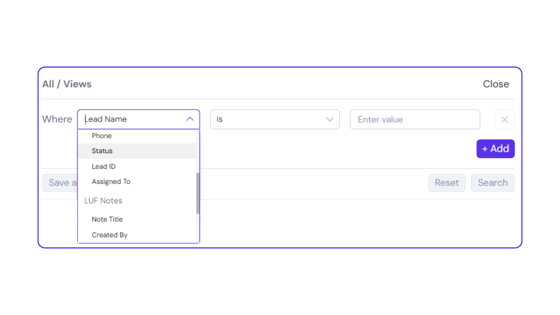
Look Up Field
Purpose:
Create relational links between records across the same or different objects to manage data with context, hierarchy, and traceability.
Key Functionalities:
- Lookup Field lets you reference values from one object (source) into another (target) for seamless data referencing.
- Displays referenced values in the target object for quick contextual insight.
- Enables filtering and searching based on lookup values.
- Supports sorting records using the data pulled from the lookup field.
- Data remains synchronized. Any update in the referenced (source) record reflects automatically in the lookup field.
- Lookup fields are read-only, as they display data pulled from another record.
- Types of lookups supported:
- Self-Lookup: Reference records within the same object.
- One-to-Many Lookup: Reference records from multiple different objects.
Self-Lookup:
Self-Lookup allows you to reference records from within the same object. This is useful when you need to relate a record to another record of the same type. For example, linking one employee record to another as a supervisor.
How to Create a Self-Lookup Field:
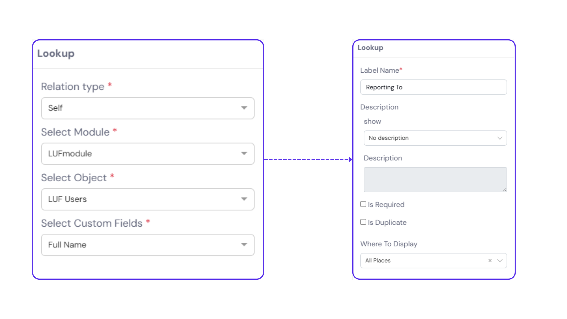
Step 1:
Go to the ‘Add Fields’ section in the object’s settings panel and select the ‘Lookup’ field type.
- In the Relation Type column, choose ‘Self’.
- The Module Name and Object Name fields will auto-populate with the name of the current object.
Step 2:
In the ‘Select Custom Fields’ dropdown, choose the specific field you want to reference (e.g., Employee Name, Deal Title, etc.). Click ‘Next’.
Step 3:
In the next screen, enter:
- A Label Name for the lookup field
- An optional Description
- Any other field settings you want to configure
Then click ‘Submit’.
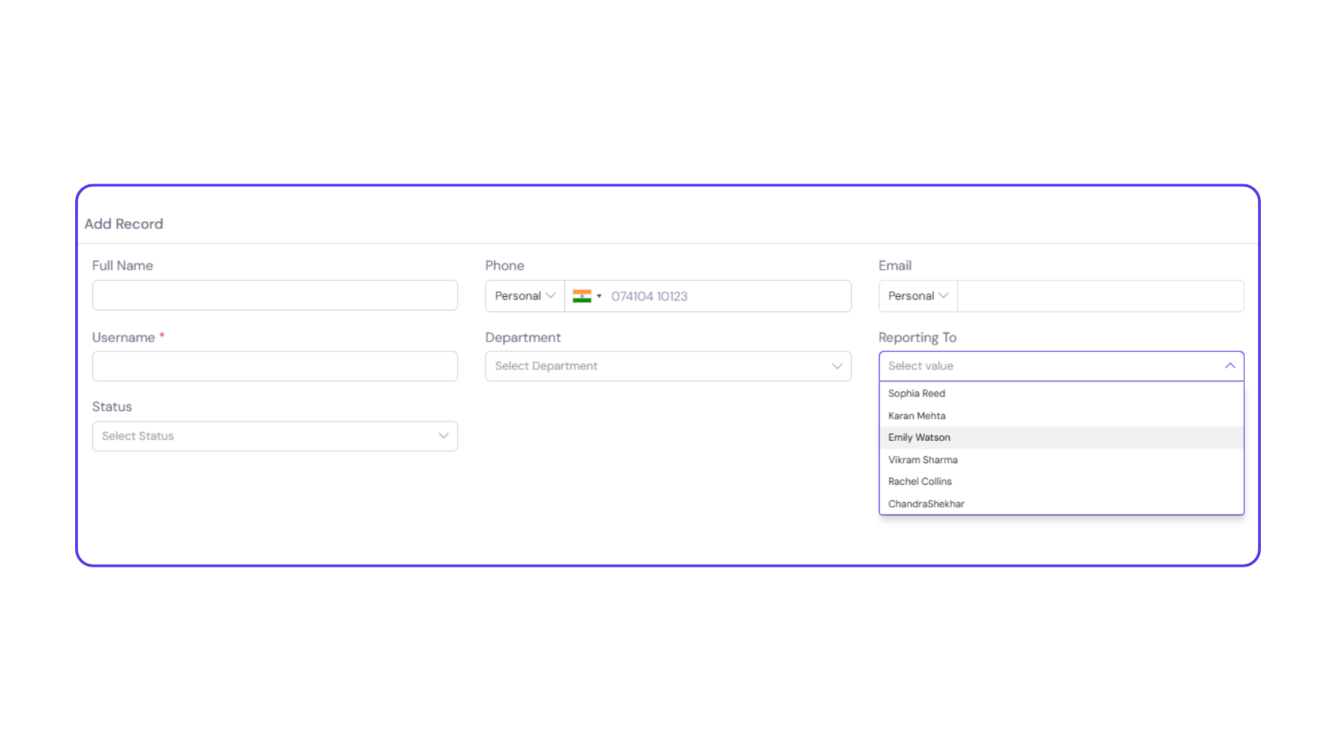
How It Works in Practice:
Once the field is created:
- When adding a new record in the object, the Self-Lookup field will auto-populate with data from the reference field you selected in Step 2.
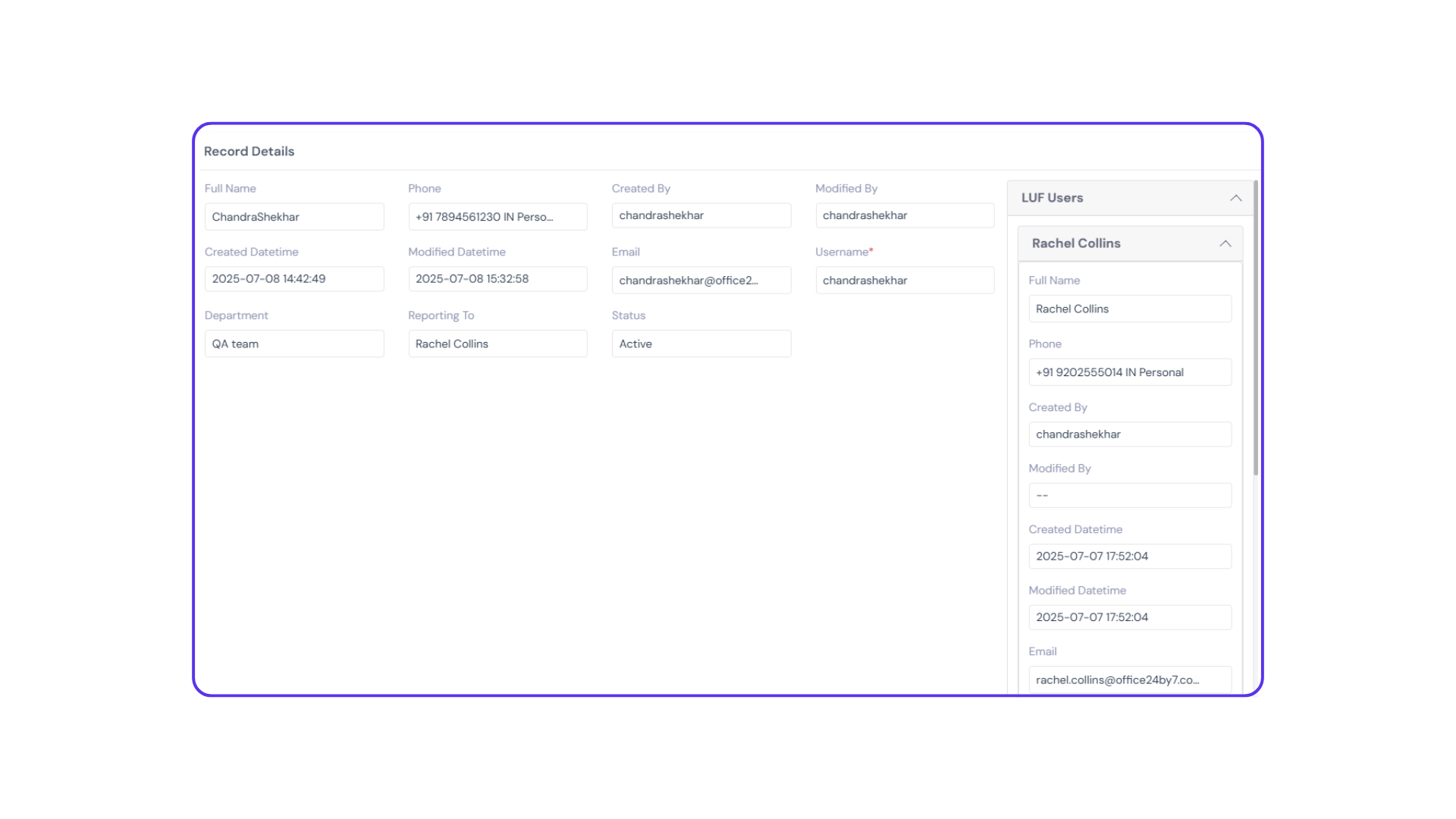
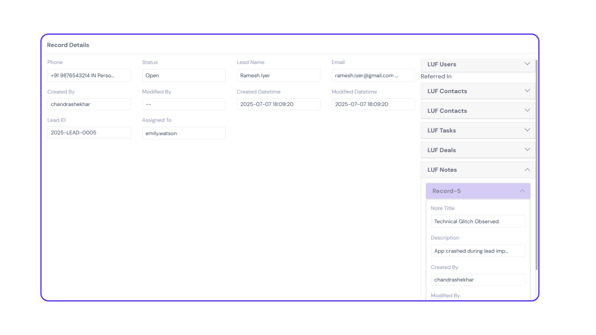
- To view additional details, navigate to the ‘Details’ tab at the top of the object panel. Clicking on the lookup value in the record details will open a side panel showing detailed data, including the custom fields and system fields related to the source record.
One-to-Many Lookup:
A One-to-Many Lookup allows you to create a reference between records in two different objects. It helps establish a source-target relationship, where a record in the target object refers to a record in the source object.
For example, a Deal can be linked to a Contact, or a Ticket can be linked to a Customer.
Note: When adding a One-to-Many Lookup field, ensure that you select a unique value field from the source object. Selecting a non-unique field may lead to conflicts due to duplicate values, affecting data integrity and reference accuracy.
How to Configure a One-to-Many Lookup:
Step 1:
Go to the ‘Add Fields’ section of the object and select ‘Lookup’ as the field type.
- In the Relation Type dropdown, choose ‘One-to-Many’.
Step 2:
From the ‘Select Module’ and ‘Select Object’ dropdowns, choose the module and object from which you want to create a reference (i.e., the source object).
Step 3:
In the ‘Select Custom Fields’ dropdown, choose the specific field in the source object you want to reference (e.g., Customer Name, Project Title, etc.).
Step 4:
Under On Delete Behavior, select:
- Cascade – if you want the corresponding record in the target object to be automatically deleted when the source record is deleted.
- None – if you want the target record to remain unaffected when the source record is deleted.
Step 5:
Click ‘Next’.
Step 6:
Enter the Label Name, Description, and configure any other field settings.
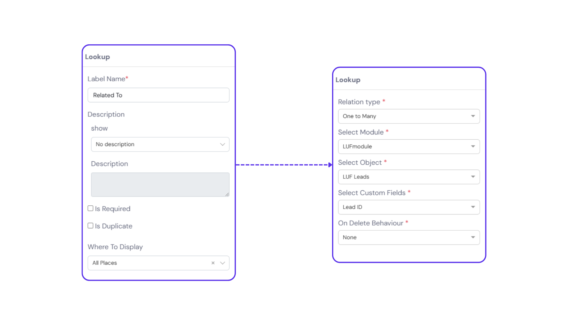
Step 7:
Click ‘Submit’ to finalize.
How It Works in Practice:
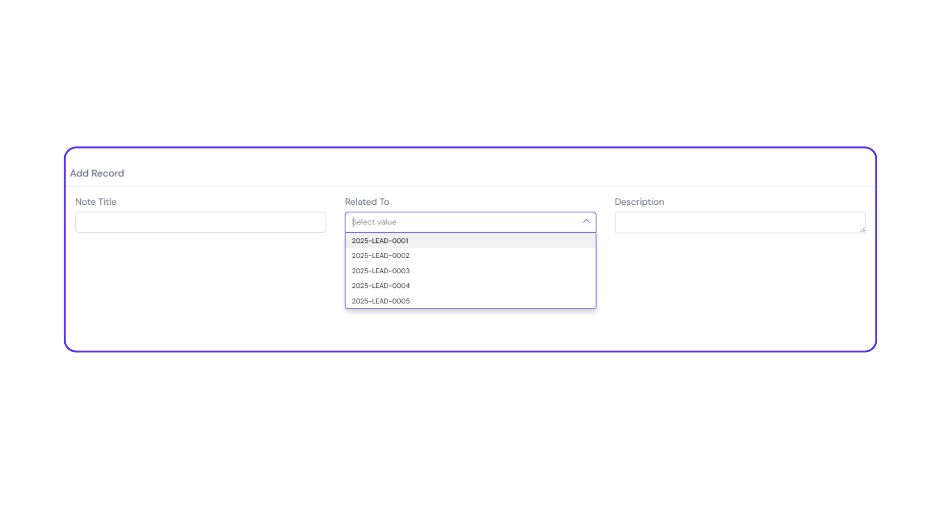
While Adding a Record:
- Navigate to the ‘Add Record’ panel in the target object.
- In the lookup field, you’ll see a dropdown populated with values from the referenced field in the source object.
- Simply select the appropriate reference while creating the record.
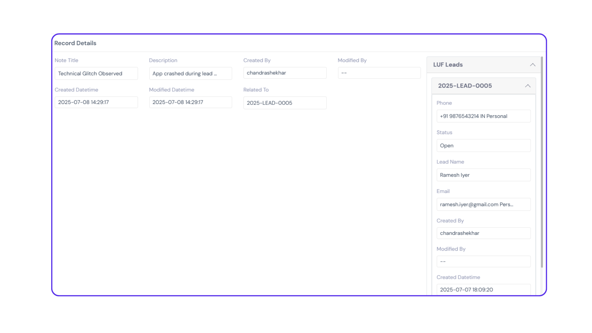
In the Details View:
- After record creation, go to the ‘Details’ tab.
- Clicking on the lookup field opens a side panel displaying all data pulled from the source record, including custom fields and system fields.
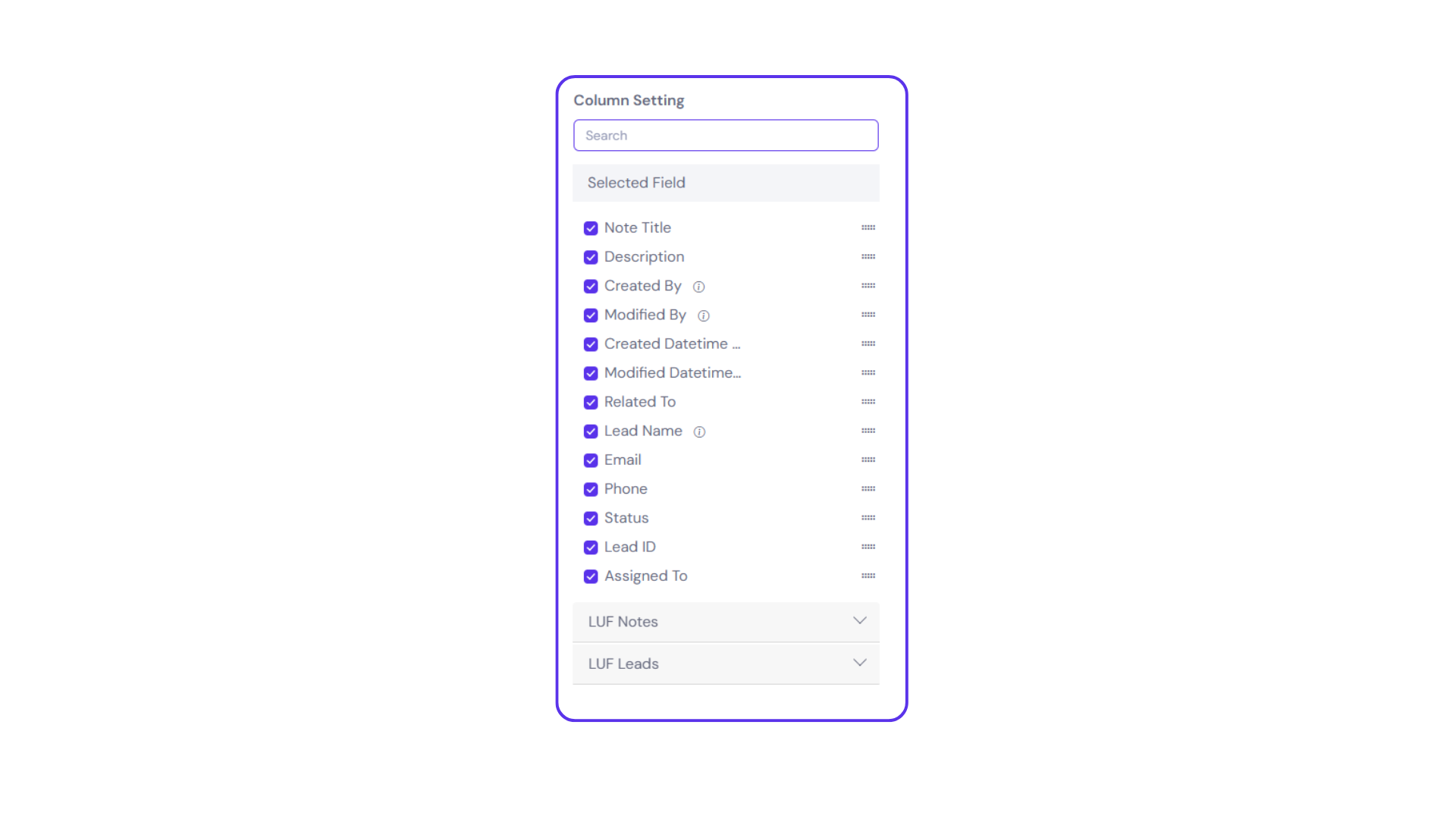
Column Display Settings:
- Click the column settings icon (top-right corner of the object panel).
- You’ll see a dropdown labeled with the source object’s name, listing all its fields.
- Check the boxes beside any fields you’d like to display within the target object, then click ‘Save’.
Filters:
- When setting up filters in the target object, fields from the source object are also available.
- This allows you to filter target records based on source object values, enhancing your ability to segment and analyze related data.
Example: Filter tickets based on the region or category of the customer they’re linked to.
Viewing References in Source Object:
- Go to the ‘Details’ tab in the source object.
- You’ll see:
- The number of target records referring to that source record.
- The list of objects where it’s being referenced.
- Quick access to view those target records.
Use Cases:
Customer Name in Support Tickets
- Add a lookup field in the “Support Tickets” object to reference the “Deals” object.
- This helps agents quickly identify the customer associated with the ticket, without duplicating data.
- Project Manager in Tasks Object
- In the “Tasks” object, create a lookup to the “Projects” object to pull the name of the assigned project manager.
- Allows team members to see who’s responsible at the project level while working on individual tasks.
Assignee
The Assignee field allows you to designate a specific user to take ownership of a task, record, or item. It enables streamlined accountability and ensures clear responsibility assignment within the system.
Auto Number Sequence
The Auto Number Sequence field automatically generates a unique, sequential value each time a new user is created. This value can be customized to include a combination of numbers, text, and date formats, allowing for flexible structuring based on your organizational needs. This field is ideal for generating user IDs, employee codes, or any standardized unique identifier.
Key configuration options include:
Custom Format:
Combine alphanumeric characters, dates, or static text.
Sequential Numbering:
Automatically increment numbers with each new entry.
Separator Type:
Define the character used to separate different components in the sequence (e.g., hyphen, underscore).